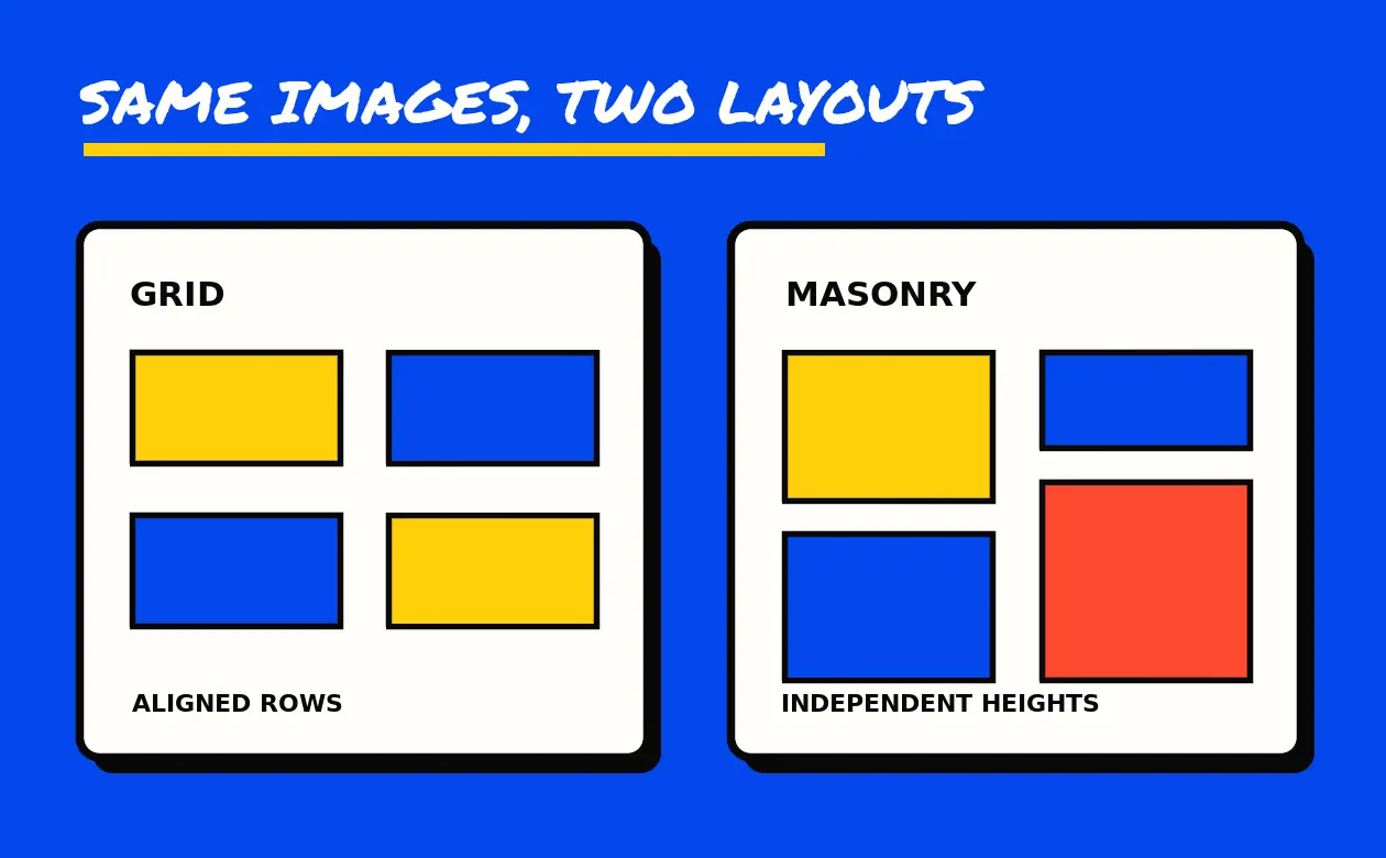
“No Margins” and “Full Width” sounded like two ways to ask for the same thing. In the 2016 portfolio menu saved on Goodie’s domain, both could describe four columns without gaps. The difference was the frame around them. The No Margins example put the tiles inside a container. In the Full Width example, the tile block sat directly in the surrounding section.
That detail explains why the old navigation is worth keeping. Its pages separate three choices that often get bundled together in a design brief: how images line up, how close they sit, and how much of the page they can occupy. The surviving pages identify the SuperFine HTML template. They document demonstrations, without establishing who built or commissioned any sample project.
What the six saved examples show
The labels span two, three and four columns. The six baseline captures each contain nine image elements. All six use the heading Portfolio Grid Layout, even though three of them carry the masonry class in the layout markup. A page heading alone would put two different layout families in the same bucket.
- 2-column grid example
- 3-column grid example
- 4-column grid example
- 2-column masonry example
- 3-column masonry example
- 4-column masonry example
The saved four-column No Margins example and Full Width example both carry the no-margin marker. The archived markup distinguishes a tile gap from the width of the outer container. Use that distinction when describing a change to an actual site.
Start with the material you have to show
Suppose a print studio has six case studies. Four show square product images and two show tall posters. A grid with even rows could give the pieces the same area, which helps visitors compare the six projects at a glance. The poster thumbnails would need a crop or letterboxing. The complete poster could still be visible after opening its project page.
A masonry layout could let the posters keep their height. That puts more of each design on display, at the cost of less predictable alignment across columns. Check the layout at phone width and step through the project links with the keyboard. Closely packed rows can make it harder to see which link has focus or which caption belongs to which image.
Choose the outside width separately. A grid with no gaps can read like a continuous contact sheet inside the same frame as the writing. Extending it across the page gives the pictures more space but also makes the relationship between headings, descriptions and images more important. Test the two widths with the same six images before choosing.
The old menu groups an entry under Simple or Style 2–5, then names the spacing or width choice. A style number alone does not describe a card’s hover treatment, overlay or caption placement. The reference below retains each number as a menu label. Use the source page when the original body survives and that detail matters.
Portfolio entries in the saved menu
Each entry gives the layout family, column count and recorded menu labels. Many targets survive here as links recorded on other pages. The reference preserves those identities and filenames. Only the six examples linked above were used to compare all the baseline layouts.
2-column grid
- 2-column grid · Simple · No Margins
portfolio-grid-2-cols-no-margin.html - 2-column grid · Simple · Full Width
portfolio-grid-2-cols-full.html - 2-column grid · Style 2 · Default
portfolio-grid-2-cols-style2.html - 2-column grid · Style 2 · No Margins
portfolio-grid-2-cols-style2-no-margin.html - 2-column grid · Style 2 · Full Width
portfolio-grid-2-cols-style2-full.html - 2-column grid · Style 3 · Default
portfolio-grid-2-cols-style3.html - 2-column grid · Style 3 · No Margins
portfolio-grid-2-cols-style3-no-margin.html - 2-column grid · Style 3 · Full Width
portfolio-grid-2-cols-style3-full.html - 2-column grid · Style 4 · Default
portfolio-grid-2-cols-style4.html - 2-column grid · Style 4 · No Margins
portfolio-grid-2-cols-style4-no-margin.html - 2-column grid · Style 4 · Full Width
portfolio-grid-2-cols-style4-full.html - 2-column grid · Style 5 · Default
portfolio-grid-2-cols-style5.html - 2-column grid · Style 5 · No Margins
portfolio-grid-2-cols-style5-no-margin.html - 2-column grid · Style 5 · Full Width
portfolio-grid-2-cols-style5-full.html
3-column grid
- 3-column grid · Simple · No Margins
portfolio-grid-3-cols-no-margin.html - 3-column grid · Simple · Full Width
portfolio-grid-3-cols-full.html - 3-column grid · Style 2 · Default
portfolio-grid-3-cols-style2.html - 3-column grid · Style 2 · No Margins
portfolio-grid-3-cols-style2-no-margin.html - 3-column grid · Style 2 · Full Width
portfolio-grid-3-cols-style2-full.html - 3-column grid · Style 3 · Default
portfolio-grid-3-cols-style3.html - 3-column grid · Style 3 · No Margins
portfolio-grid-3-cols-style3-no-margin.html - 3-column grid · Style 3 · Full Width
portfolio-grid-3-cols-style3-full.html - 3-column grid · Style 4 · Default
portfolio-grid-3-cols-style4.html - 3-column grid · Style 4 · No Margins
portfolio-grid-3-cols-style4-no-margin.html - 3-column grid · Style 4 · Full Width
portfolio-grid-3-cols-style4-full.html - 3-column grid · Style 5 · Default
portfolio-grid-3-cols-style5.html - 3-column grid · Style 5 · No Margins
portfolio-grid-3-cols-style5-no-margin.html - 3-column grid · Style 5 · Full Width
portfolio-grid-3-cols-style5-full.html
4-column grid
- 4-column grid · Style 3 · Full Width
portfolio-grid-4-cols-style3-full.html - 4-column grid · Style 5 · Full Width
portfolio-grid-4-cols-style5-full.html
2-column masonry
- 2-column masonry · Simple · No Margins
portfolio-masonry-2-cols-no-margin.html - 2-column masonry · Simple · Full Width
portfolio-masonry-2-cols-full.html - 2-column masonry · Style 2 · Default
portfolio-masonry-2-cols-style2.html - 2-column masonry · Style 2 · No Margins
portfolio-masonry-2-cols-style2-no-margin.html - 2-column masonry · Style 2 · Full Width
portfolio-masonry-2-cols-style2-full.html - 2-column masonry · Style 3 · Default
portfolio-masonry-2-cols-style3.html - 2-column masonry · Style 3 · No Margins
portfolio-masonry-2-cols-style3-no-margin.html - 2-column masonry · Style 3 · Full Width
portfolio-masonry-2-cols-style3-full.html - 2-column masonry · Style 4 · Default
portfolio-masonry-2-cols-style4.html - 2-column masonry · Style 4 · No Margins
portfolio-masonry-2-cols-style4-no-margin.html - 2-column masonry · Style 4 · Full Width
portfolio-masonry-2-cols-style4-full.html - 2-column masonry · Style 5 · Default
portfolio-masonry-2-cols-style5.html - 2-column masonry · Style 5 · No Margins
portfolio-masonry-2-cols-style5-no-margin.html - 2-column masonry · Style 5 · Full Width
portfolio-masonry-2-cols-style5-full.html
3-column masonry
- 3-column masonry · Simple · No Margins
portfolio-masonry-3-cols-no-margin.html - 3-column masonry · Simple · Full Width
portfolio-masonry-3-cols-full.html - 3-column masonry · Style 2 · Default
portfolio-masonry-3-cols-style2.html - 3-column masonry · Style 2 · No Margins
portfolio-masonry-3-cols-style2-no-margin.html - 3-column masonry · Style 2 · Full Width
portfolio-masonry-3-cols-style2-full.html - 3-column masonry · Style 3 · Default
portfolio-masonry-3-cols-style3.html - 3-column masonry · Style 3 · No Margins
portfolio-masonry-3-cols-style3-no-margin.html - 3-column masonry · Style 3 · Full Width
portfolio-masonry-3-cols-style3-full.html - 3-column masonry · Style 4 · Default
portfolio-masonry-3-cols-style4.html - 3-column masonry · Style 4 · No Margins
portfolio-masonry-3-cols-style4-no-margin.html - 3-column masonry · Style 4 · Full Width
portfolio-masonry-3-cols-style4-full.html - 3-column masonry · Style 5 · Default
portfolio-masonry-3-cols-style5.html - 3-column masonry · Style 5 · No Margins
portfolio-masonry-3-cols-style5-no-margin.html - 3-column masonry · Style 5 · Full Width
portfolio-masonry-3-cols-style5-full.html
4-column masonry
- 4-column masonry · Simple · No Margins
portfolio-masonry-4-cols-no-margin.html - 4-column masonry · Simple · Full Width
portfolio-masonry-4-cols-full.html - 4-column masonry · Style 2 · Default
portfolio-masonry-4-cols-style2.html - 4-column masonry · Style 2 · No Margins
portfolio-masonry-4-cols-style2-no-margin.html - 4-column masonry · Style 2 · Full Width
portfolio-masonry-4-cols-style2-full.html - 4-column masonry · Style 3 · Default
portfolio-masonry-4-cols-style3.html - 4-column masonry · Style 3 · No Margins
portfolio-masonry-4-cols-style3-no-margin.html - 4-column masonry · Style 3 · Full Width
portfolio-masonry-4-cols-style3-full.html - 4-column masonry · Style 4 · Default
portfolio-masonry-4-cols-style4.html - 4-column masonry · Style 4 · No Margins
portfolio-masonry-4-cols-style4-no-margin.html - 4-column masonry · Style 4 · Full Width
portfolio-masonry-4-cols-style4-full.html - 4-column masonry · Style 5 · Default
portfolio-masonry-4-cols-style5.html - 4-column masonry · Style 5 · No Margins
portfolio-masonry-4-cols-style5-no-margin.html - 4-column masonry · Style 5 · Full Width
portfolio-masonry-4-cols-style5-full.html
A footer in the August 2016 footer sample also linked to Our Portfolio at portfolio-4-cols.html. Its list has several distinct grid and masonry variants elsewhere. The footer label leaves the intended arrangement unspecified.
Homepage entries in the saved menu
The dropdown also offered corporate, creative, fullscreen, portfolio, blog, magazine and shop examples. Those words tell you the kind of site the chooser was browsing. In a brief, a label such as “portfolio” is a starting point. Spell out whether a visitor should browse by project, compare examples or find the contributor’s role. The menu labels below identify the old choices, while the individual demo pages remain unverified.
- Home Corporate 1
index-corporate-1.html - Home Corporate 2
index-corporate-2.html - Home Corporate 3
index-corporate-3.html - Home Corporate 4
index-corporate-4.html - Home Corporate 5
index-corporate-5.html - Home Creative 1
index-creative-1.html - Home Creative 2
index-creative-2.html - Home Full Screen 1
index-fullscreen-1.html - Home Full Screen 2
index-fullscreen-2.html - Home Full Screen 3
index-fullscreen-3.html - Home Portfolio 1
index-portfolio-1.html - Home Portfolio 2
index-portfolio-2.html - Home Portfolio 3
index-portfolio-3.html - Home Blog 1
index-blog-1.html - Home Blog 2
index-blog-2.html - Home News Magazine 1
index-magazine-1.html - Home News Magazine 2
index-magazine-2.html - Home Shop 1
index-shop-1.html - Home Shop 2
index-shop-2.html
Read the rest of the demo menu
The same 2016 menu separated the blog index from an individual article. The grid and timeline entries offered different ways to browse; the single-post entry specified a page without sidebars. If you are reviewing a blog design, try finding an older post in the index, then read one complete article on a phone. A layout may make one task easier while the other still needs work.
Headers, page titles and footers appear as separate groups. Check them at different moments. Find the main navigation before you start reading, look for the page title as you enter, then see whether the footer helps after you reach the end. A transparent header deserves a separate readability check over the lightest and darkest pictures you intend to use.
The accordion, chart, message-box and slider links name different pieces of a page. In a real brief, give each piece one job. An accordion can hold answers people open individually. A chart should make a comparison understandable with labels and units. A message should explain what happened and what to do next. For a slide show, check whether a reader can reach its important content at their own pace.
The entries below preserve exact labels and paths from the dated menu, sitemap or footer. They identify the examples. The original layouts and forms for these links are outside the surviving set described here.
Blog layouts
- Left Side Bar
Blog › Blog Gridblog-grid-left-bar.html
Source menu 2016-08-13 - Right Side Bar
Blog › Blog masonryblog-masonry.html
Source menu 2016-08-13 - No side bar
Blog › Blog Singleblog-single-no-bar.html
Source menu 2016-08-13 - Right Side Bar
Blog › Blog Small Imageblog-thumbnails.html
Source menu 2016-08-13 - Left Side Bar
Blog › Blog Timelineblog-timeline-left-bar.html
Source menu 2016-08-13 - Right Side Bar
Blog › Blog Timelineblog-timeline.html
Source menu 2016-08-13
Components and sliders
- Accordions
Shortcodesaccordions.html
Source menu 2016-08-13 - Charts
Shortcodescharts.html
Source menu 2016-08-13 - Message Boxes
Shortcodesmessage-boxes.html
Source menu 2016-08-13 - Full Width
Features › Sliders › OWL Sliderslider-owl.html
Source menu 2016-08-13 - Ken Burns
Features › Sliders › Revolution Sliderslider-revolution-kenburns.html
Source menu 2016-08-13
Footers
- Footer Version 4
Features › Footersfooter-4.html#footWrapper
Source menu 2016-08-13 - Minimal Footer 1
Features › Footersfooter-minimal-1.html#footWrapper
Source menu 2016-08-13 - Minimal Footer 2
Features › Footersfooter-minimal-2.html#footWrapper
Source menu 2016-08-13
Headers and menus
- Header 5
Features › Headersheader-5.html
Source menu 2016-08-13 - Header 6
Features › Headersheader-6.html
Source menu 2016-08-13 - Dark Header
Features › Headers › Semi Transparent Headerheader-semi-transparent-dark.html
Source menu 2016-08-13 - Transparent Header 1 Fluid
Features › Headers › Transparent Headerheader-transparent-1-fluid.html
Source menu 2016-08-13 - Full width Transparent
Features › Headersheader-transparent-full.html
Source menu 2016-08-13 - Menu Animations
Features › Headersmenu-animations.html
Source menu 2016-08-13 - Dark Sub Menu
Features › Sub Menussub-menu-dark.html
Source menu 2016-08-13
Home and other template pages
- Home Page
home.html
Source menu 2016-08-13 - One Page 2
Homeone-page-2.html
Source menu 2016-08-13 - Pricing
Pagespricing.html
Source menu 2016-08-13 - Register Style 1
Pages › Registerregister-1.html
Source menu 2016-08-13 - Register Style 2
Pages › Registerregister-2.html
Source menu 2016-08-13
Page titles and sidebars
- Page with Both Sidebars
Pages › Pagespage-both-bars.html
Source menu 2016-08-13 - Centered Page Title 2
Features › Page Titlespage-title-center-2.html
Source menu 2016-08-13 - Centered Page Title
Features › Page Titlespage-title-center.html
Source menu 2016-08-13 - Page Title Parallax
Features › Page Titlespage-title-parallax.html
Source menu 2016-08-13
Goodie’s historical portfolio guide covers what the sample project fields can support as evidence. The web design resources guide helps when the next decision is about improving a site you already have.